Recently the nonpartisan Tax Policy Center published an analysis of the tax plans that each current presidential candidate has promised to enact (note that John Kasich has not published a tax plan). Mind you, it is Congress, not the president, who sets tax rates, but the president does have a fairly powerful bully pulpit from which to influence Congress on taxes. But regardless of that, this is each candidate’s stated goals, and it will be what the candidates will be judged on by voters in the election.
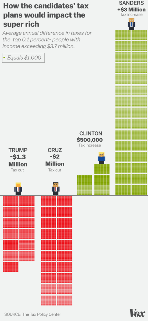
The friendly folks at Vox have taken all these numbers and turned them into graphs. In this graph, it shows how each candidate’s tax plans will affect the taxes paid by the top 0.1%, which is households that earn more than $3.7 million per year. The numbers are how much more each household will pay in taxes.
Clearly, the Republicans plan on dramatically cutting taxes for the wealthy (Cruz by $2 million per household), while the Democrats plan on raising taxes on them. But there is also a sizable difference between Clinton and Sanders. Sanders proposes that households whose income exceeds $3.7 million will pay an average of $3 million in additional taxes, while Clinton proposes they pay half a million more. Indeed, Clinton’s proposal is the most moderate and least disruptive proposal of all the candidates from either party. According to the calculations, “Under the Sanders plan, those at the top of the income scale would see their after-tax income fall by almost 45 percent”.
To make these numbers more meaningful, the tax plan proposed by Sanders would raise $596 billion just from the top one percent of households, which is more than the entire military spending budget in 2015 $583 billion). Clinton’s plan would raise $89 billion from the same group, which is more than the cost of the federal food stamp program ($78 billion). Cruz’s program would give $463 billion to the top one percent of households. Trump’s program would give $312 billion to the same group, which is less than Cruz’s plan, but Trump refuses to cut any spending, so he wins the “award” for the plan that would drive up the deficit the most.
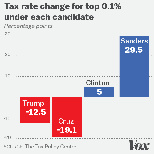
Finally, this graph shows how much the tax rate (in percent) would change for the top 0.1% under each candidate’s plan (in absolute change):
So for example, if a (wealthy) household is paying 30% of their income in federal taxes, Sanders would (on average) change that to have them pay 59.5%.


7 Comments
Kinda reminds me of that scene in West Wing where Sam talks about how “making the rich pay their fair share” is a stupid talking point.
Obviously a great deal has changed since then, and his arguments don’t apply the same way today that they did then, but I think it’s a fair point to consider regarding Sanders’ platform.
Great job bringing all this together, but I really can’t stand that last graphic (not your doing, admitted). Describing percentage changes of percentages becomes very misleading and causes more confusion than clarity.
Oh wait…I take it back. Those appear to be percentage point changes, not percent changes. So the last graphic might be okay after all.
Yeah, the last graphic is absolute change in tax rate. I’ve added an example to make that more clear. Sorry.
What I find remarkable is that a combination of a smaller tax rate on upper incomes with an equal lowering of the military spending would accomplish Sander’s goal and benefit the country. None of the peeps in this country can even comprehend the real value of what is spent in federal budgets, or in what thoughtful re-allocation could accomplish.
Patricia — yup. We spend an insane amount on our military, including on weapons that the Pentagon doesn’t even want or need. Unfortunately, that spending is up to Congress, and I see little chance of it going down no matter who is president (and likely would go up under a Republican). I would give Sanders credit for being more likely to try to lower military spending (compared to Clinton), but I have absolutely no faith that Congress would go along with him.
Not your fault; it was purely a case of insufficient coffee on my part. What stuck out was the 19.1 percentage point drop under Cruz. That number seemed fishy to me, when you consider the actual taxes paid by the wealthy. For instance, during the 2012 election, it was revealed that Mitt Romney paid 13.9% and 15.3% in 2010 and 2011. Warren Buffett similarly made claims that his effective tax rate is lower than his secretary’s.
The big problem with the analysis is that there are so many factors that influence actual taxes paid. For starters, it offers no way to look at the impact of different types of income (e.g., investment vs. salary). It also has nothing about common deductions like mortgage interest. The calculator just seems a bit overly simplistic relative to the complexity of the tax code to be accurate.