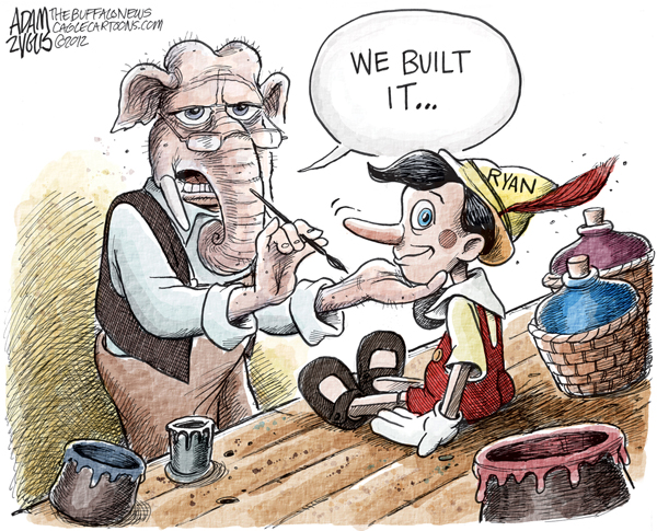
The Republicans say that Mitt Romney and Paul Ryan will tell us the “hard truths” we need to hear.
And they they turn around and say they are going to cut taxes, balance the budget, save Medicare, and increase spending (especially for the military). It is like a fairy tale with an impossibly happy ending.
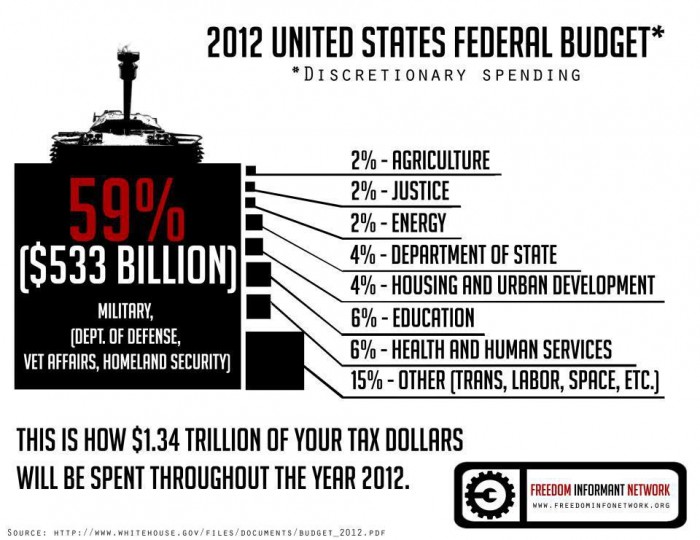
From where I stand, the only thing “hard” about the “truths” coming out of the Republicans is that they are hard to believe. Like, how is Romney going to cut spending while increasing the military budget?


3 Comments
I agree 100% but that graph is a crime against honest graphical communication. It looks like we’re supposed to judge the relative size of expenditures by the size of each box but that is wildly misleading. “Other” at 15% is 1/4 the size of “Military” but the “Other” box is about 1/16 the size of the “Military” box. I’m guessing that the height of the box is actually proportional to the size of the expenditure but even that is distorted by lining up vertically rather than horizontally.
If this graph was made by the “Freedom Informant Network” then they should change their name to the “Freedom Misinformant Nutwork”. I find this sort of dishonest graphic disgusting whether I agree or disagree with the point being pushed. Shame on them.
The real irony here is that one of the recommended related posts is “Truth in Advertizing?”
Now that you mention it, that is a weird graph. It is like they sized the box by making one dimension proportional to the number they are representing, but then scaled both dimensions. Stupid!
I think I didn’t notice because I tend to look at the actual numbers. Sorry about that!
The chart is poor because it is the linear dimensions that are scaled correctly, while the eye sees the area of the boxes for comparison.
It’s not the first time I’ve seen this travesty: Sometimes charts are designed with circles, the diameters of which are supposed to represent the quantity of interest. Of course it is the area that the eye latches onto, which is grossly over-exaggerated…