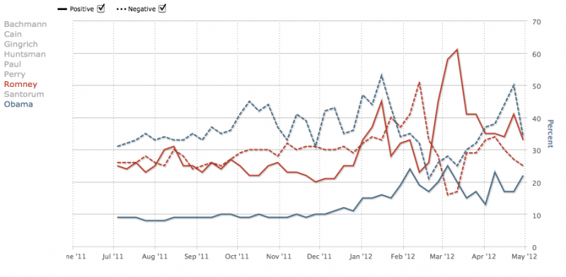
The next time someone complains about how the media is in love with Obama, just show them this graph:
This chart is driven by data from the non-partisan and widely respected Pew Research Center’s Project for Excellence in Journalism. It tracks negative and positive coverage over time for the major political candidates. The red lines are for Romney, and the blue lines are for Obama.
The solid lines are for positive coverage in the mainstream media. In the last year, coverage of Romney has always been more positive than coverage of Obama.
The dashed lines are for negative coverage. The chart shows there has been more negative coverage of Obama than negative coverage of Romney most of the time.
My guess is the people who are complaining about positive coverage of Obama are people who believe any positive coverage of Obama is too much.


4 Comments
Either that or the obvious, which is there isn’t much positive news about Obama. I love to see some positive news, about anything it’s just there isn’t much being posted, published or broadcast.
IK isn’t saying the media is biased against Obama, just that it isn’t biased toward Obama. Undercutting the conservative argument that Obama and the media are in bed together.
It would be interesting to see these numbers compared against polling numbers.
TG: I’m not sure the data agree with your statement. The ratio of goo vs. bad for each candidate are definitely in favor of Romney. Whereas in the Obama data, the negative are always above the good, for Romney, at worst they were close – early in the reported data. As you get closer to present, the favorable seems to outshout the negative. Except for that blip in February.
I do find it interesting that Romney’s media attention varies so much and Obama’s seems more constant.